

In all my years of experience working in the content creation space, I’ve received plenty of requests from bloggers, marketers, and even digital marketing agencies to craft amazing articles. To my dismay, the majority of these pieces end up buried under pages and pages on Google. Only a minority of them turned out to be successful blog posts.
But what I noticed is that the ones that ended up being successful in generating social sharesand creating hundreds of backlinks shared one common feature that no one seems to notice.
It’s so simple that you’ll slap yourself on the forehead.
The articles that ended up being successful were all creatively designed. No, I’m not talking about infographics.
I’m talking about how they’re styled and how they incorporate elements of design to make them look more visually appealing. But what are these exact design elements?
What I’m about to share with you is a completely fresh perspective that’s going to serve you very well as a writer, regardless of your niche.
As the story unfolds, I’ll be citing Brian Dean’s blog post about “17 Untapped Backlink Sources” from Backlinko as an important reference.
Using a Certain Font Size
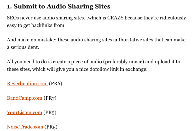
Image via Backlinko
I want you to pay attention to the font that’s used in the image above. There’s nothing particularly special about it. But take a closer look.
If you notice, the font size used in the blog post is significantly larger than other blog posts that you commonly see from other sites.
Image via Backlinko
To be a little bit more specific, the font size he uses is 16px. But why am I pointing this out? It’s because a larger font provides your audiences with an immersive reading experience.
It subconsciously draws their attention in such a way that they have nothing else to look at or focus on other than the text that’s right in front of them.
Theoretically, using a font size this large should create a more pleasant experience for your readers, resulting in better engagement and encouragement for them to stay on your site.
Larger fonts allow you to appeal to a wider audience. There are a number of blogs who use font sizes so tiny that you’ll need a magnifying glass to read it. Personally, anything lower than 12px isway too small.
Frankly, it’s annoying, even for the tech-savvy fellows who are familiar with the Ctrl + Scroll combination, because zooming in makes everything look pixelated, cluttered, and hard to read.
The moment that your audience feels irritated by being unable to read your posts, they bounce.
The following image is an excerpt taken from a post entitled “Reduce Your Bounce Rate In One Second.” It’s written by Daniel Scocco, the renowned owner of Daily Blog Tips.
Image via Daily Blog Tips
Daniel increased his blog’s font-size from 12px to 13px and experienced a marginal decrease in his bounce rate. It’s not exactly a life-changing improvement, but there’s definitely something worth paying attention to here.
If you want your blog posts to perform at the same level as some of the top bloggers, use a larger font.
Only Use Short Paragraphs
Image via Backlinko
Take a look at Brian’s writing style, and then read it out loud. If you’ve seen his videos and heard him speak, you’d probably be hearing his voice in your head.
That’s the exact experience that you want to create for your audience. You want them to imagine theauthor’s voice resonating in their ear canals.
But how do you go about achieving that?
Easy. Just use a conversational tone and keep your paragraphs short. Preferably, limit yourself totwo to three sentences per paragraph.
It goes against everything you learned in school, but it works.
This applies to sentences as well. Short sentences make your points more concise, and it’s a lot easier to read compared to elongated sentences.
If you’re familiar with the dated phrase “wall-of-text,” you’ll know exactly what I’m talking about.
Imagine if you were asked to read something that looked like this.
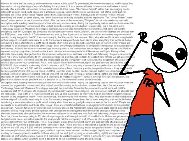
DON’T. DO. THIS.
Look at that. It’s atrocious. Anyone’s immediate next course of action would be to simply close that page and move on.
To be perfectly honest, audiences are getting pretty bratty these days. The slightest bit of irritation can spur them to bounce away from your page.
Providing your audience with the optimal reading condition plays a huge role in keeping your bounce rates to the absolute minimum.
Everything your audience reads has an emotional impact on them. It’s entirely dependent on the way you craft it that makes that impact either positive or negative. Naturally, you’d want it to be positive.
That’s right, just pressing the “Enter” button and spacing out your text a lot more than usual can generate that positive impact for you.
Be More Generous With Bolds
Image via Convince & Convert
Regular blog posts tend to ignore the use of bold text. More often than not, they limit that usage to their headers and sub-headers.
That’s a mistake.
The above image is an excerpt from the top contender for a very competitive keyword “content marketing tips,” which was written by Leo Widrich and published on Convince & Convert.
If you noticed, he bolds several other important points throughout the blog post. It makes skimming and scanning through the article a whole lot easier.
There’s a large portion of your audience that has the habit of scanning through an article before reading deeper into it. Truth be told, styling your blog post in a similar fashion will make it more aesthetically appealing.
But that doesn’t mean that you should go ahead and bold every other word on all your posts. Knowing that you should be bolding is one thing, but knowing exactly what you should be bolding is another.
Apart from bolding, you can use other types of font styles as well, such as
strikethroughs and Italics.Here’s a simplified list of instances where you can incorporate the use these three font styles:
- Bolds: Emphasize a point, highlight strong keywords
- Italics: Dampen a phrase to make it sound softer but more articulate
Strikethroughs:Indicate common mistakes and misconceptions
Hold your horses, let’s not get too excited about this.
Don’t even think about using Bolds and Italics in the same word. The entire purpose of Bolds and Italics is so your audience can differentiate certain keywords from the rest of the paragraph. Using it this way would be completely redundant.
Start Using Brackets to Inject Positive Emotion
It’s always a joy to read Brian Dean’s posts. When you’re able to inject positive emotion into valuable information, you’ll create an entertaining yet enjoyable learning experience.
To some extent, it’s like having a good day at school.
There will always be teachers who just can’t stand the sight of their class. It’s no hidden secret that they absolutely despise what they do. No one enjoys their classes. In fact, you’ve probably encountered (and hated) some of these teachers in your years of adolescence.
But on the opposite end of the spectrum, you have teachers who couldn’t think of anything else that they’d rather do than teach. In this case, the teacher who’s injecting positive emotion into his or her lessons is the latter.
Brackets are equivalent to the corny jokes that teachers just love to make. No one laughs at it, but somehow, everyone looks more comfortable and the atmosphere feels relaxed.
The best way to explain the use of brackets is to kind of guess what your audience is thinking as they read through your content.
If you get it right, it’ll be pretty impressive. And if you don’t, it encourages them to think about it anyway. Talk about a win-win situation!
Here’s how Brian Dean uses brackets in his blog posts.
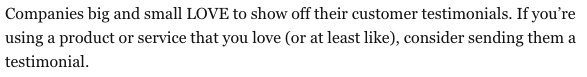
Image via Backlinko
Notice how he places “or at least like” in brackets right after “love”? It’s like he’s guessing what his audience might be thinking when they come across that word. He’s embracing the curious minds who enjoy asking questions, while appeasing the readers who find the world “love” somewhat uncomfortable.
The end result? His audience feels at ease, and they proceed to read the rest of the article with utter joy and amusement.
Here’s another instance where he uses brackets for a completely different purpose.

Image via Backlinko
It’s pretty obvious that he’s trying to inject a bit of humor with “blah” and “yawn”. It’s funny, and it makes his audience smile. If it didn’t make you smile, then you need to lighten up a little.
Using brackets in your blog posts grants you the ability to control the emotions of your audience. They’re like cue cards whispering to them when they should laugh, or when they should nod to themselves in ways so subtle that it’s almost equivalent to cheating.
Use Dots to Create Suspense
Image via Backlinko
Image via Backlinko
You’ll realize Brian employs this “dotting” technique several times throughout his blog post. I had to read the sentences a couple of times before I actually understood why he did this.
As my vision grew closer to the dots at the end of the sentence, I found myself growingincreasingly curious about what the next sentence was going to be.
Embarrassingly, I got so excited that I found my eyes immediately cheating my way to the next line a split second faster than usual. It’s inconspicuous, but it gives the next line that punch.
I believe most readers shared the same experience, but they become so engrossed in these successful blog posts that they conveniently forget to notice this technique.
Time to Get Creative and Push the Standards of Writing
For far too long, writers and bloggers have conformed to industry standards, fearing that indulging themselves in these unorthodox techniques will make their content look unprofessional…
…But they couldn’t be more wrong.
See what I did there? I digress.
All these unwritten rules about writing need to be challenged, especially if you want your content to stand out.
No one notices plain Jane sitting in the back row. But as soon as that brunette chick clad in a classy dress and curled hair steps in, everyone’s eyes dart towards her. Which of the two would you prefer your content to look like?
Naturally, you don’t want your blog posts to just sound smart; you want them to look sexy as well.
As writers, we’re so much more than just keyboard mashers. We’re intelligent individuals who translate meaningful thoughts into professional text1. Essentially, we’re designers for words.We need to start acting that way.
Now it’s time for you to put everything that you read into practice and start designing your blog posts to look like the elegant and gorgeous pieces of content they’re supposed to be.
But don’t take it from me. Take it from the guys who employed these creative writing techniques in the first place!
To view the original article Click Here
Consider the possibility that there was an a la mode rundown of web journals in your specialty that you could use to discover quality connection opportunities.
ReplyDeleteI have uplifting news.
seo training in chennai